Interactive: where immigration supported declining housing demand
In this series of maps and tables, Intel examines which US markets were hit by a double wave of outbound migrants and reduced immigration flows last year.
At its core, the housing market is a story about where and why people move from place to place – and now that picture is becoming more visible.
New population estimates from the US Census Bureau show which parts of the country people continued to leave last year, and where incoming migration could not fully offset those losses. They also confirm markets that continued to benefit from an influx of new potential home buyers.
The data – which covers a one-year period ending July 1, 2025 – sheds light on a pivotal time for a real estate industry that continued to fracture along regional lines when it came to home inventory and sales, and on the uneven impact of trade policy and immigration enforcement that occurred last year.
Explore this data down to the county level with Intel’s interactive maps.
Ins and outs
In the first half of 2025, housing market growth was very uneven.
The success or struggles of local markets reflected their unique inventory situations, general housing price levels, and the industries dependent on international trade.
But local markets were also affected in different ways by the flow of people into and out of population centers. And for the first time we know what that looked like and how it changed.
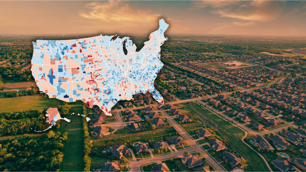
Take the map below. It shows the counties most affected by U.S. residents moving across county or state lines – the prime candidates for purchasing a home at the time of the move or in the near future.
In the blue shaded places there was more incoming domestic migration than outgoing migrants during this period. In areas shaded red, more people left for other provinces than moved in to replace them.
We’re seeing people moving from places like California, the High Plains, the southern part of the Mississippi River, and some select urban areas like Miami.
The markets that benefited from inbound domestic migration through July of last year were generally in the Pacific Northwest, non-coastal western population centers, the large suburbs of Texas, the Carolinas in addition to Georgia and Tennessee, central Florida, New England and parts of the Midwest.
For many of these places, the general population trend is not new.
But what was new – especially in the first half of last year – was the extent to which markets that had once depended on international immigration experienced a sudden shock to the system.
The map below shows how each province’s net international immigration rate in the year ending mid-2025 compared to the previous year.
In almost every province in the country, immigration rates fell or stagnated. And in some places there was a particularly pronounced effect.
These immigration trends coincided with stricter border enforcement during the final months of the Biden administration, and new aggressive detention and deportation policies during the early months of the Trump administration.
To be clear, the map above shows how rates changed between 2024 and 2025, not what net immigration inflows and outflows looked like at any given point in time.
There is still net positive immigration in many markets. This has slowed or offset population decline in many cities, but may not last for long.
At the other end of the spectrum, the fastest-growing U.S. counties generally benefit from domestic migrants and international immigration flows.
Sure, the housing market is subject to a host of factors other than just population movements, but this is a crucial part of the picture. Intel will continue to monitor how these various factors play out at the local level.
Email Daniel Houston